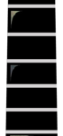

Late last night, I received two material mock ups of the fingerboard. On the left is the full fingerboard with paua abalone used for the 12th fret oval material. In the middle (and detailed on the right) is the same layout using white Mother of Pearl. The original plan was to use a deep blue paua shell for the oval, but we’re all heavily leaning toward the white MOP at this point. For one thing, my initials have the potential for getting lost in the paua. Secondly, since I had already decided to use white MOP for the 24th fret and tulip tip of the fingerboard, the paua, though beautiful, started to look a bit forced and out of place.
Noticeably absent from the design is the ring of sterling silver that was to bind the 12th fret oval. Ultimately, there might not be enough room to accommodate this without reducing the font size. We also run the risk of making it look too busy by virtue of cramming many different materials in such a small space. While I continue to explore this option, I am not planning on binding the oval at present.
The modified wedge shape for the fret markers remains Tahitian black MOP. In the end, they will be less visible than what’s shown in the mock ups, but the unique way black MOP reflects light will let you know they’re there!
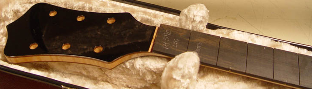
These are very rough mock ups, created so we can decide on the material to be used. Soon, the angle, size, and alignment of each element will be carefully determined, and Mica will ensure that everything is “just exactly perfect.”
