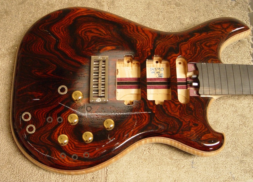
Between this post and the last, I’ve gone through six more control layouts – most of which were variations on what you’ve already seen… I didn’t feel the need to post them all. The traditional “diamond” knob layout just wasn’t doing it for me, and I’ve pretty much turned away from it at this point.
I’m calling this my “contoured” layout, where the knobs reflect the actual contour of the body (just like the three switches below them. I’ve got the main volume knob where I want it (that is, in front of the bridge), and the position of all the other knobs are based off of that.
Things didn’t look quite right with this layout, though, until my left brain had its say. I spaced all knobs equidistant from any adjacent knob (the three left knobs form an equilateral triangle), and it was that symmetry that ultimately sealed the deal for me.
Although I’d like to get the volume knob a bit closer to the bridge, it would either put the MIDI controls too close to where the tailpiece would be, or destroy the symmetry of the layout altogether. Neither byproduct is worth it when we’re only talking about fractions of an inch.
A few notes… Mica provided me with gold plated brass knobs I’ve chosen for the guitar for this layout – and it’s a good thing, since they are sized differently from the plastic top-hats we’ve been using thus far. Also, you can ignore the extra knob and washers that are obviously outside of the chalk outline – they just happened to be there when the picture was taken!
Also note – it looks like we still don’t REALLY know the overall color of this guitar! With each picture taken under different lighting conditions, the guitar looks wildly different from shot to shot. I can’t wait to see it in person.

