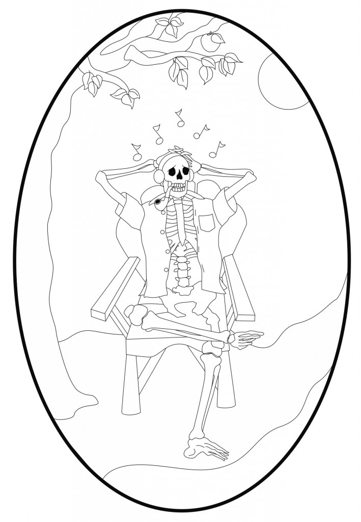
Here is the latest rendering of the medallion line art, and it’s pretty much done. You can see how precise the lines are, as well as some design simplification in this version. Most notably simplified are the ribs and spinal column, which makes this drawing slightly less anatomically correct than previous versions. The fact is that this medallion will not be very large, and such high detail will not translate well when cut from shell. The key is creating detail that suggests other detail which isn’t actually part of the finished piece. This is one of those things that only time and perspective reveal, and is one of many reasons why this process takes so long.
Some things to notice are the pipe, which has been redesigned to actually match Dad’s, as well as the all-important addition of a pocket to the shirt! Someone at Alembic suggested placing an apple in the tree, but I’m not sold on it yet. Apple trees tend to have low lying branches, and the one shown here just doesn’t otherwise look like an apple tree. Also, we never had an apple tree where I grew up. Still, I think I want to see it in color before I make the final decision.
I’ve also given some additional feedback to Mica, where I suggested the musical notes trail off toward the moon, rather than forming an arc around the skull. I also suggested to her some ways to make the headphones look a bit less like earmuffs. I expect to see these ideas implemented in the next version.
Overall, I have to say that Susan and Mica are really staying true to my original concept, and the inlay art is coming together amazingly well.

